8 posts tagged with "Visualization"

View All Tags

Compare trials across every parameter and target

See how each completed trial moves through its parameters and targets in a single parallel coordinates chart.

What's included​

Parallel coordinates​

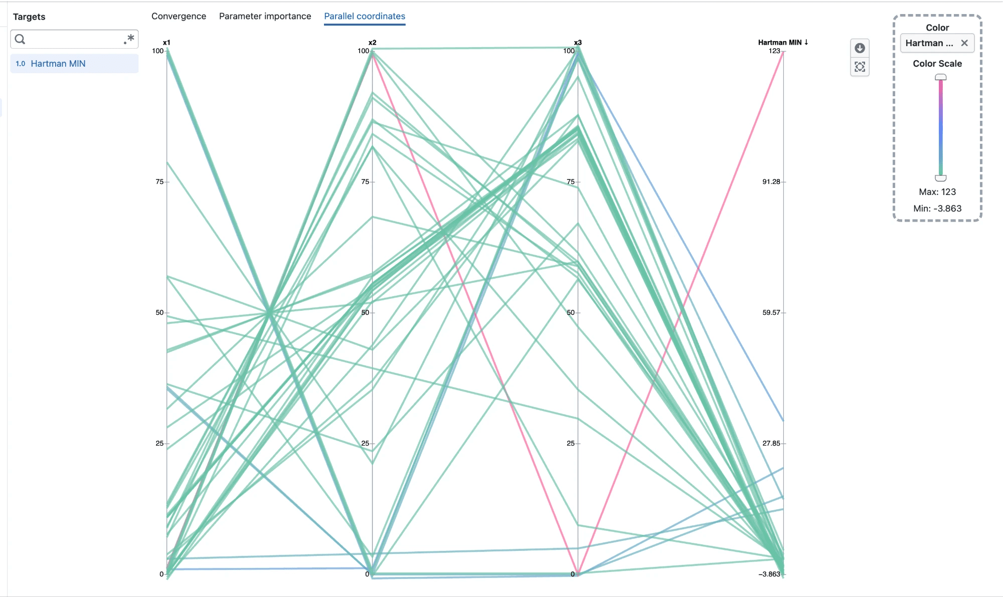
Parallel coordinates chart of Hartmann trials across x1, x2, x3 and the Hartman MIN target, colored by target value

  • Open Parallel coordinates from an experiment's Visualization page
  • Each completed trial is drawn as one line, running across every parameter on the left and the selected targets on the right
  • Every axis has its own scale, so parameters and targets with different units can be compared side by side
  • Categorical parameters show one tick per category
  • Hover a line to see that trial's values on every axis

Reorder axes​

  • Drag an axis title left or right to move that axis
  • Place related parameters next to each other, or move a parameter next to a target to see how they relate

Color by target​

  • Lines are colored by the last selected target, so you can follow where trials end up
  • Drag any target from the sidebar onto Color to color by it instead
  • A target dropped onto Color is added to the chart if it is not already selected
  • Use the color scale slider to show only trials within a range of target values
  • Clear Color to show every line in a single color

Overlapping trials​

  • Trials that share the same value on an axis are spread slightly apart, so each one stays visible
  • Trials with unique values stay exactly on their tick

Notes​

  • Only completed trials with a value on every axis are shown
  • Axis order and color choice reset when you leave the Parallel coordinates tab
Convergence plots organized by observation order

Follow optimization progress more clearly with completed results ordered as observations and predictions grouped separately.

What's included​

A clearer optimization sequence​

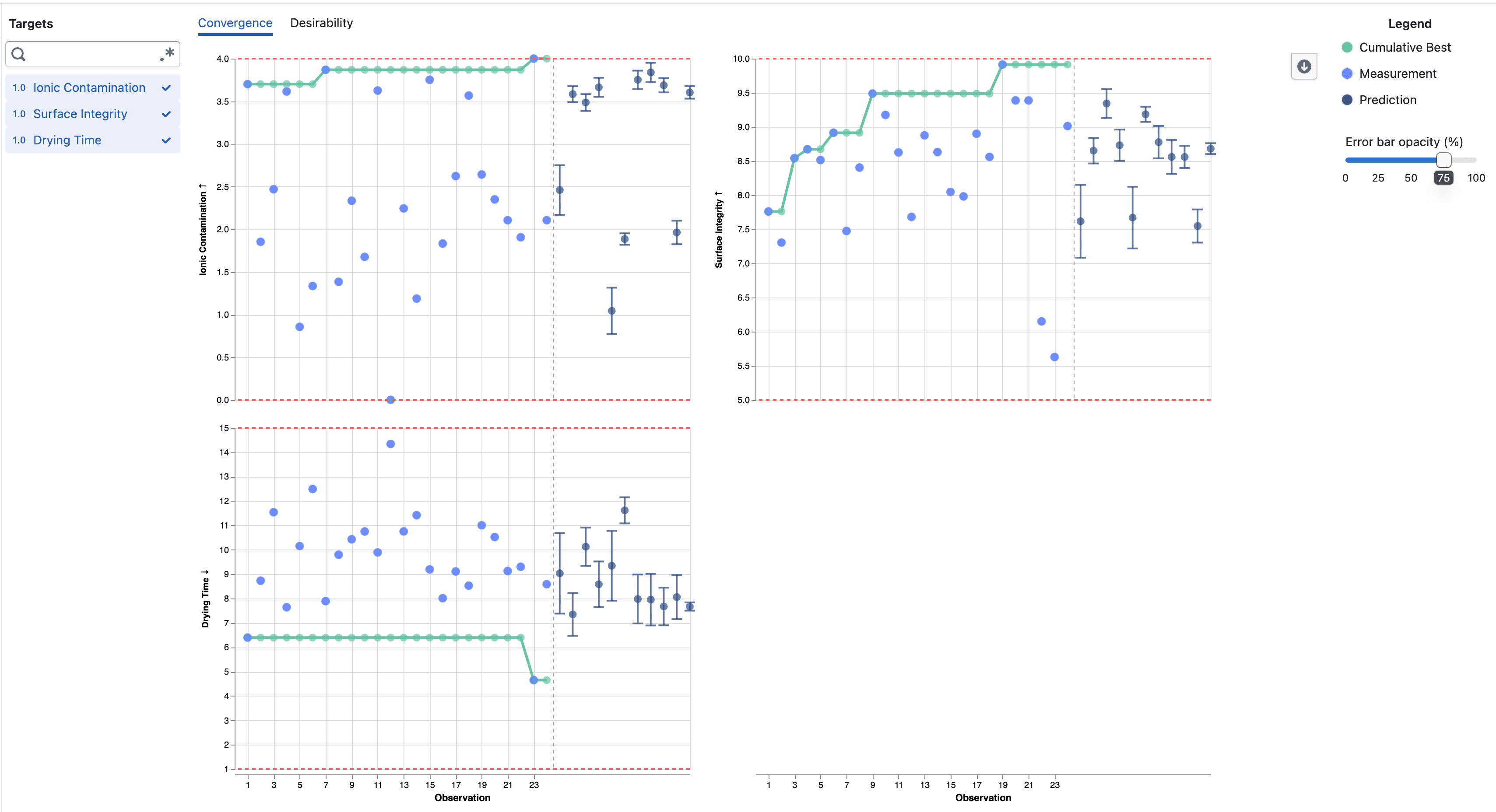
Convergence plots showing completed observations followed by predictions

  • Completed target results are numbered in completion order, without gaps from trials that did not produce a measurement
  • The original trial number and completion time remain available in the point details
  • Predictions for Pending and Accepted trials appear after the completed observations
  • A dashed divider separates measured results from predictions across selected targets

Notes​

  • The observation number can differ from the original trial number when trials finish out of order or do not produce a target result
  • Predictions remain model estimates and include error bars showing one posterior standard deviation above and below the mean

Understand what drives experiment predictions

Explore how each parameter influences experiment targets with SHAP-based importance visualizations.

What's included​

Parameter importance​

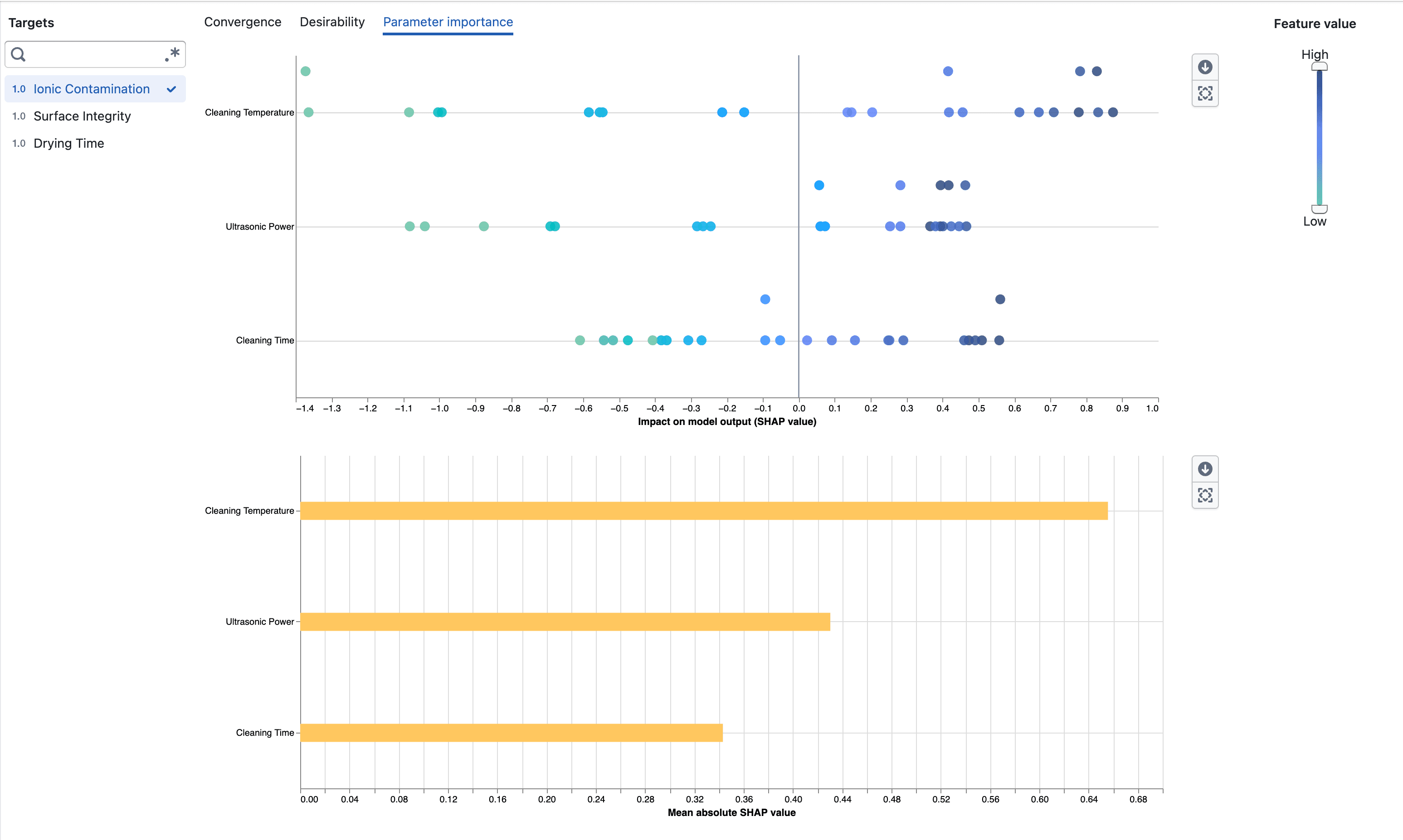
Parameter importance beeswarm and mean absolute SHAP charts

  • Open Parameter importance from an experiment's Visualization page
  • Select a target to inspect how its parameters contribute to the surrogate model output
  • Compare parameters using their mean absolute SHAP values
  • See the direction and distribution of each parameter's impact in the beeswarm plot
  • Use the feature-value scale to focus on observations with low or high numeric parameter values

Notes​

  • Parameter importance requires enough completed measurements to fit the surrogate model
  • SHAP values describe model behavior and do not imply that a parameter causes a target outcome

Target predictions for open experiment trials

View BayBE target predictions and their uncertainty for Pending and Accepted trials.

What's included​

Predictions in trial cards​

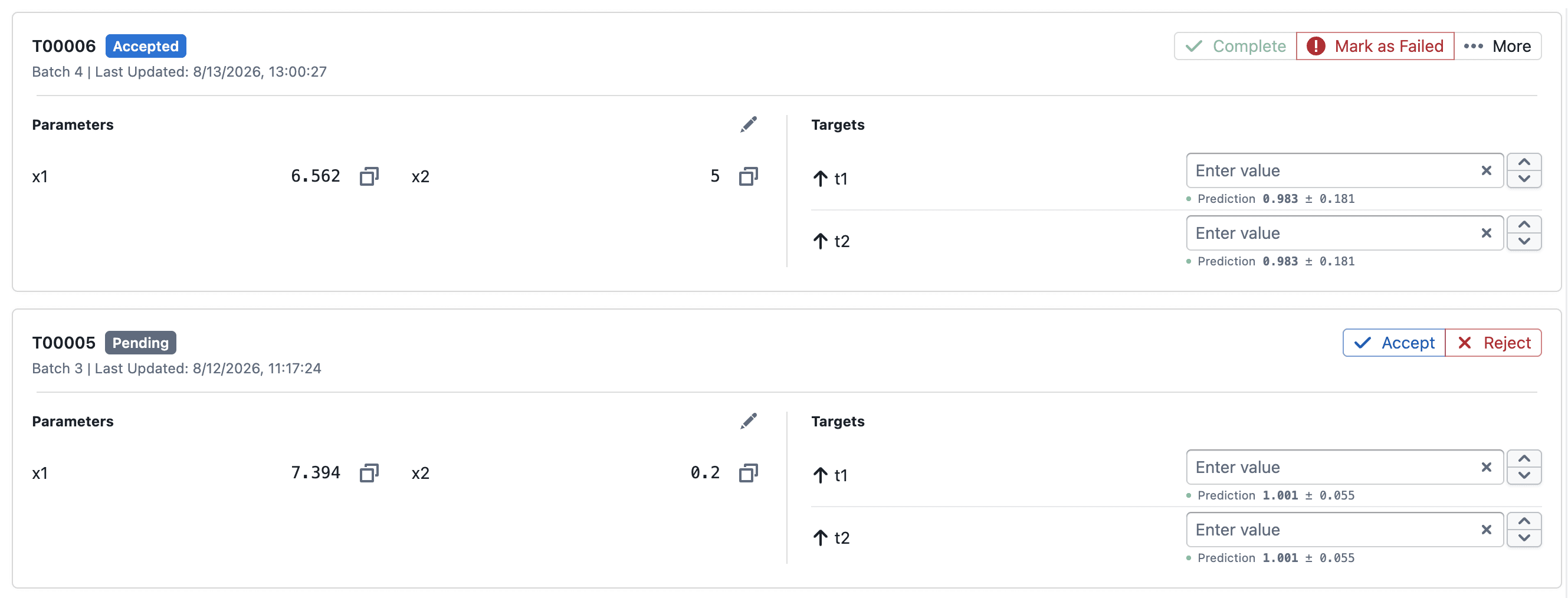
Predictions displayed for Pending and Accepted trial targets

  • Pending and Accepted trial cards show each target's predicted mean and posterior standard deviation as mean ± std
  • Predictions update as completed trial results are added to the experiment

Predictions in Convergence​

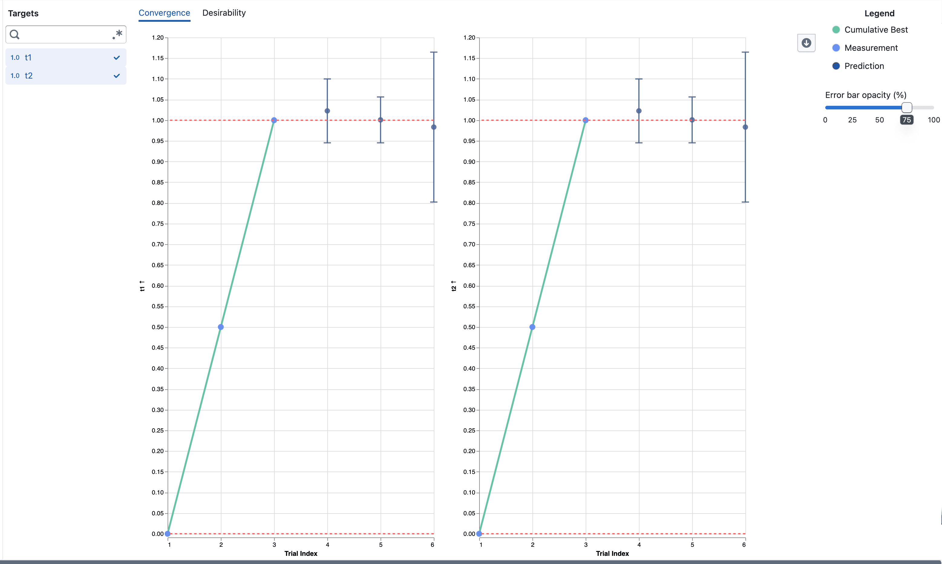
Predictions and error bars in the Convergence visualization

  • Prediction points appear alongside completed measurements on the same target axis
  • Error bars extend from mean − std to mean + std to show model uncertainty
  • Hover over a prediction to inspect its value and error-bar bounds
  • Use Error bar opacity (%) to adjust the visibility of the error bars, including hiding them at 0%

Notes​

  • Predictions are model estimates and are not measured target results
  • Error-bar bounds are not observed minimum and maximum values or a confidence interval

AI Summary for Plot Builder

Instantly understand any plot with an AI-generated summary — powered by an LLM with vision.

What's included​

How it works​

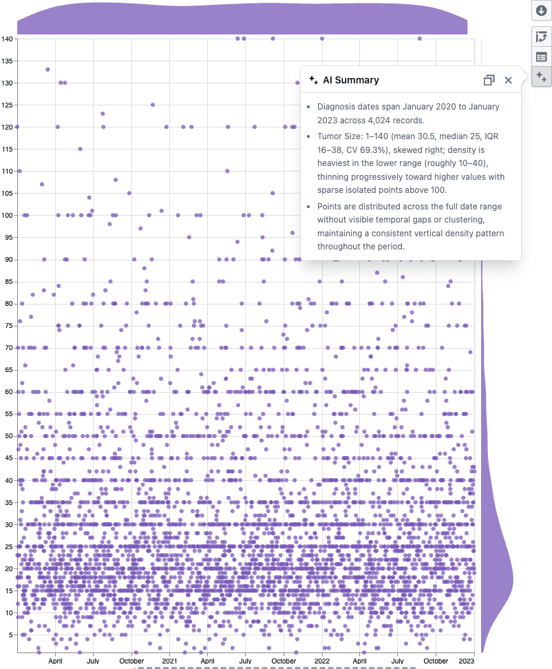
AI Summary popover on a scatter plot

  • Click the AI Summary button in the Plot Builder toolbar
  • A vision-enabled LLM reads the plot statistics and sees the chart, then returns bullet points covering distributions, group breakdowns, data quality issues, and visual patterns like clusters or outliers
  • Hit copy to paste the summary into a report or analysis note

Notes​

  • Works with scatter plots, box plots, and heatmaps
  • The summary is factual only — the LLM does not assess or make recommendations
  • If you notice any unexpected behavior, please share steps to reproduce

Desirability Convergence Chart

New desirability convergence chart for tracking optimization progress across experiment trials.

What's included​

How it works​

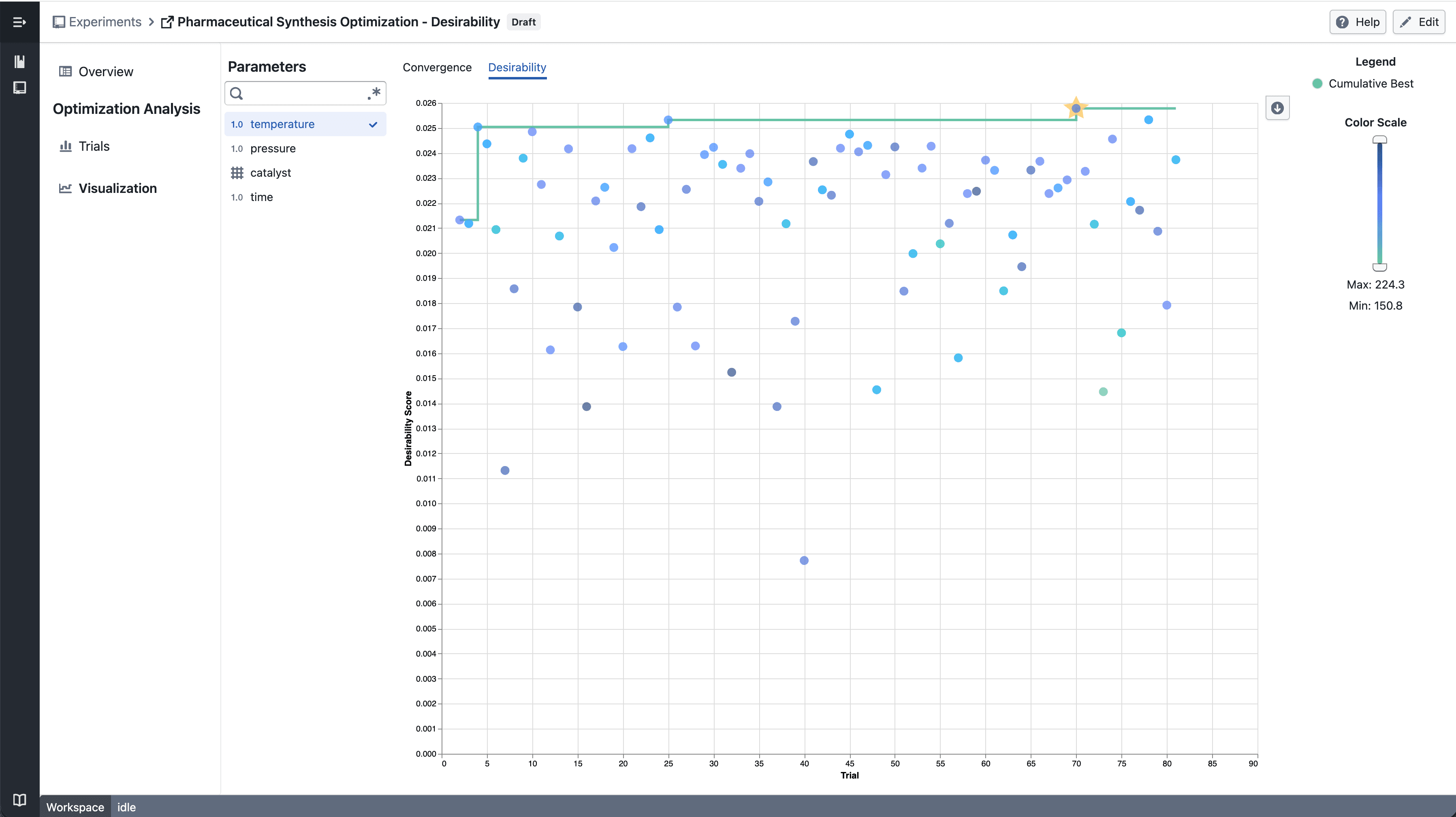
Numerical Parameter - select parameter

  • Select a numerical parameter from the parameter sidebar to color data points by that parameter's value
  • A continuous color scale shows how parameter values relate to desirability scores across trials
  • The best so far line tracks the highest desirability achieved up to each trial

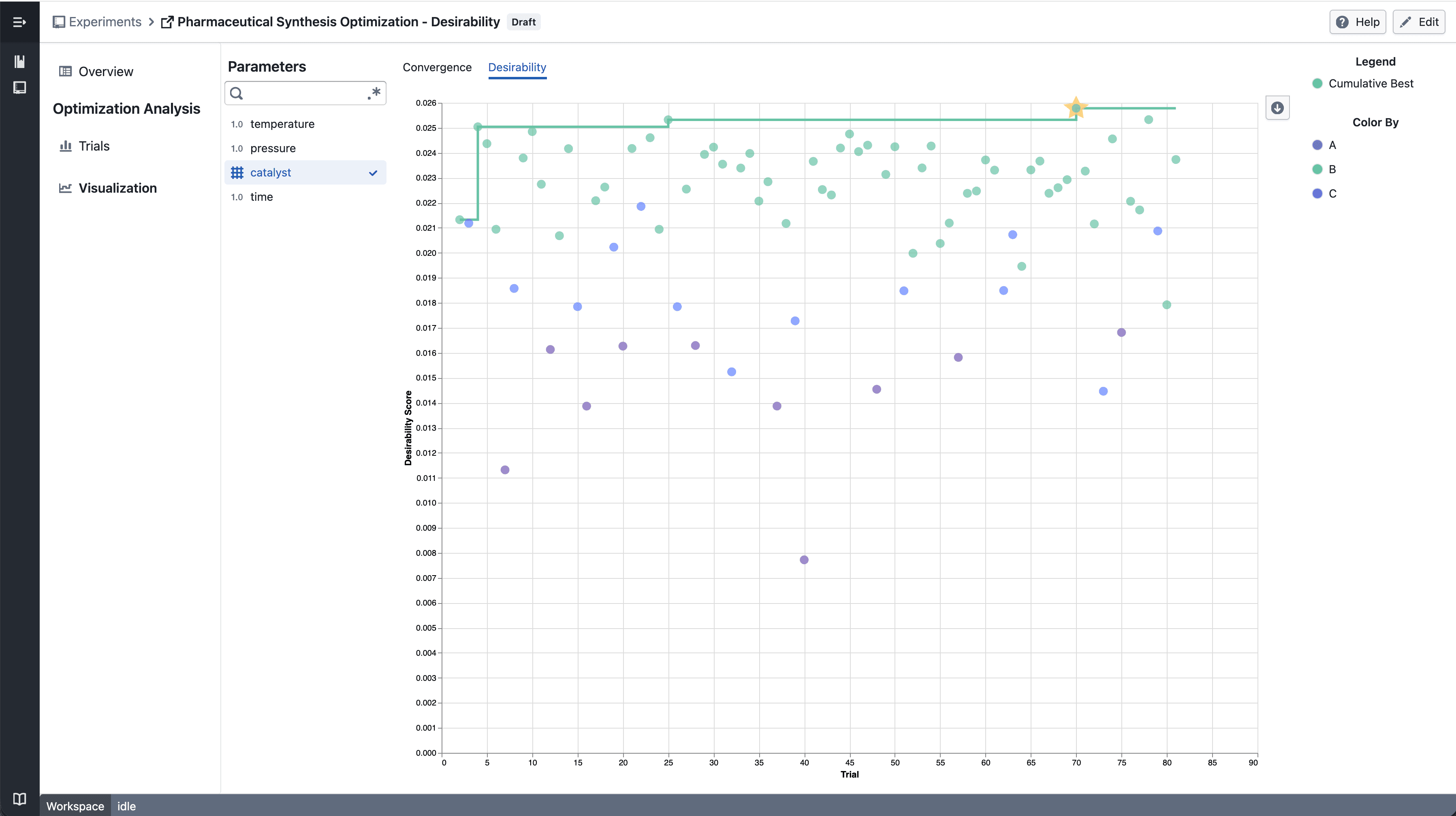
Categorical Parameter - select parameter

  • Select a categorical parameter to color data points by category
  • A discrete color legend identifies each category value

Notes​

  • The convergence chart is available under the Desirability tab in the Visualization section
  • Chart interactions and layout may continue to evolve during the beta phase
  • If you notice any unexpected behavior, please share steps to reproduce

Trellis plots in Experiment Visualization Convergence

Split convergence plot into a multi-panel grid when multiple targets are selected.

What's included​

How it works​

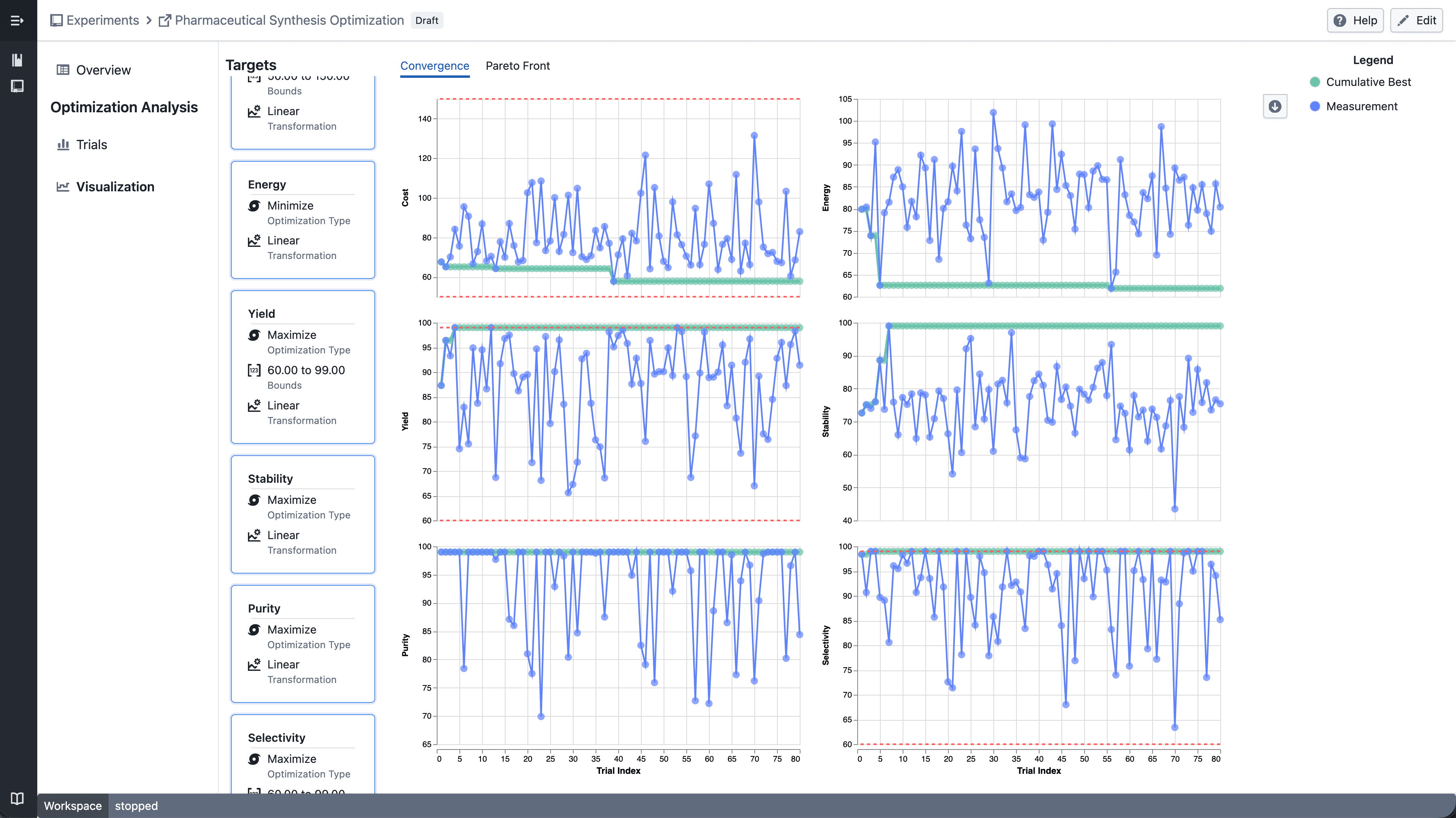
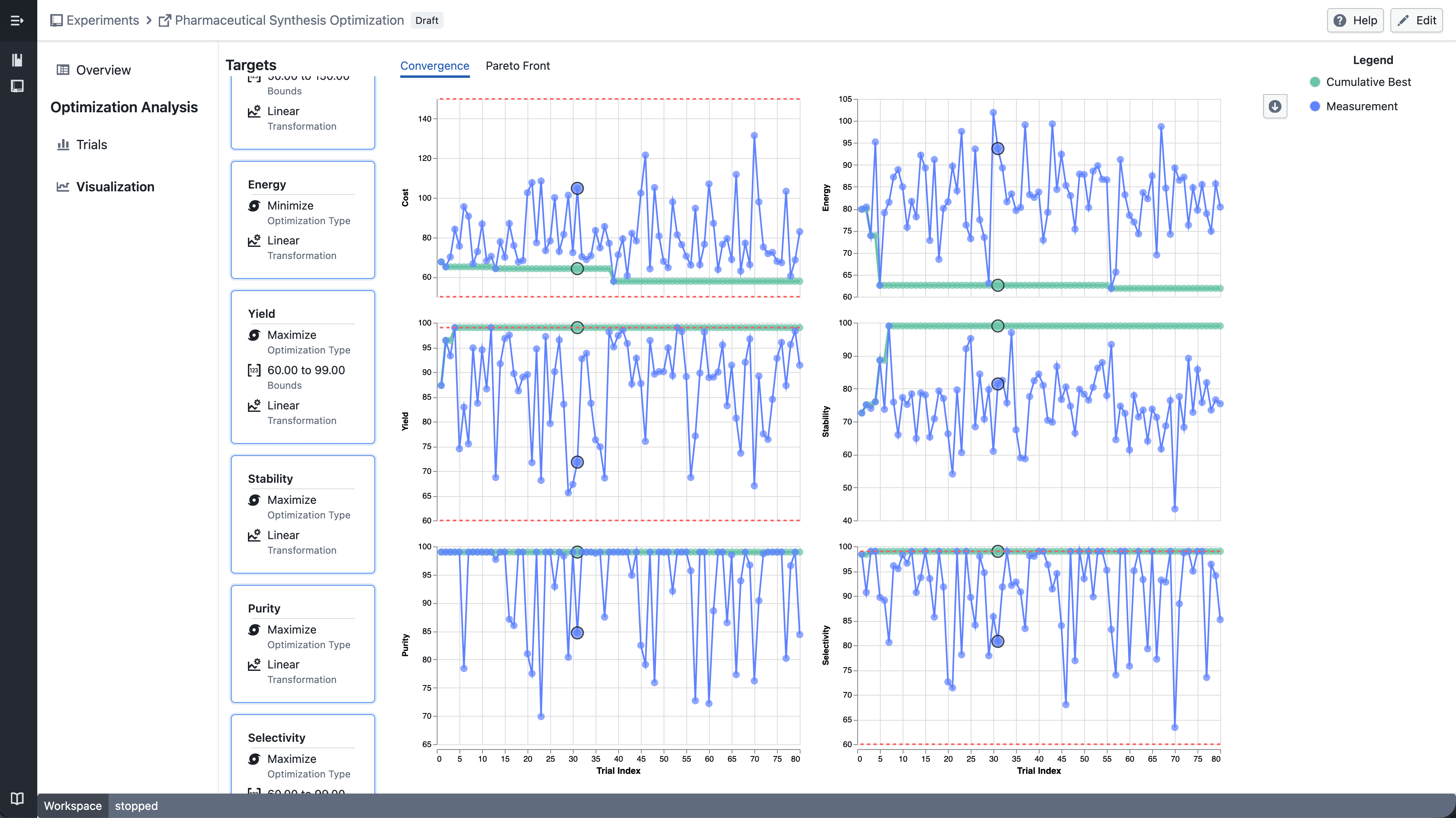
Trellis convergence plot

  • Select multiple targets from the target sidebar
  • The convergence plot automatically splits into a grid — one panel per target
  • Each panel shares the same x-axis (iteration index) but has an independent y-axis scale

Trellis - select point

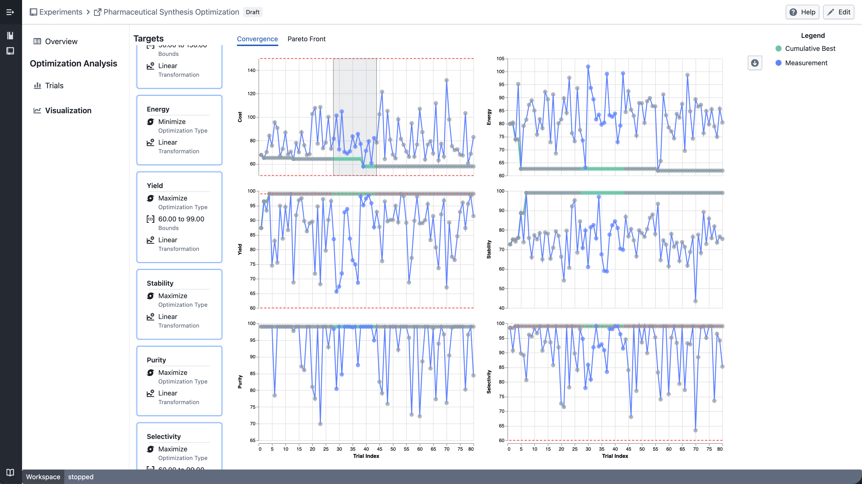
  • Click a data point to highlight the corresponding trial across all panels

Trellis - draw point

  • Shift-drag to draw a brush selection across panels
  • Points outside the selection are dimmed
  • Up to 6 targets can be displayed at a time

Notes​

  • Single target selection continues to show the standard convergence plot
  • Trellis layout and interactions may continue to evolve during the beta phase
  • If you notice any unexpected behavior, please share steps to reproduce

Trellis plots in Plot Builder

Split scatter plots and box plots into a multi-panel grid by any categorical column to compare patterns across groups side by side.

What's included​

How it works​

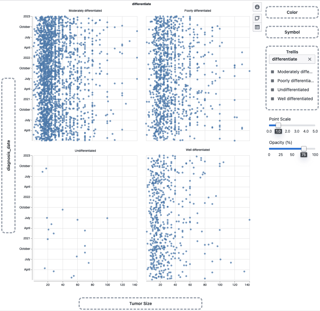
Trellis scatter plot

  • Drag a categorical column onto the Trellis drop zone in the plot sidebar
  • The plot splits into a grid of panels — one per category
  • Works with scatter plots and box plots

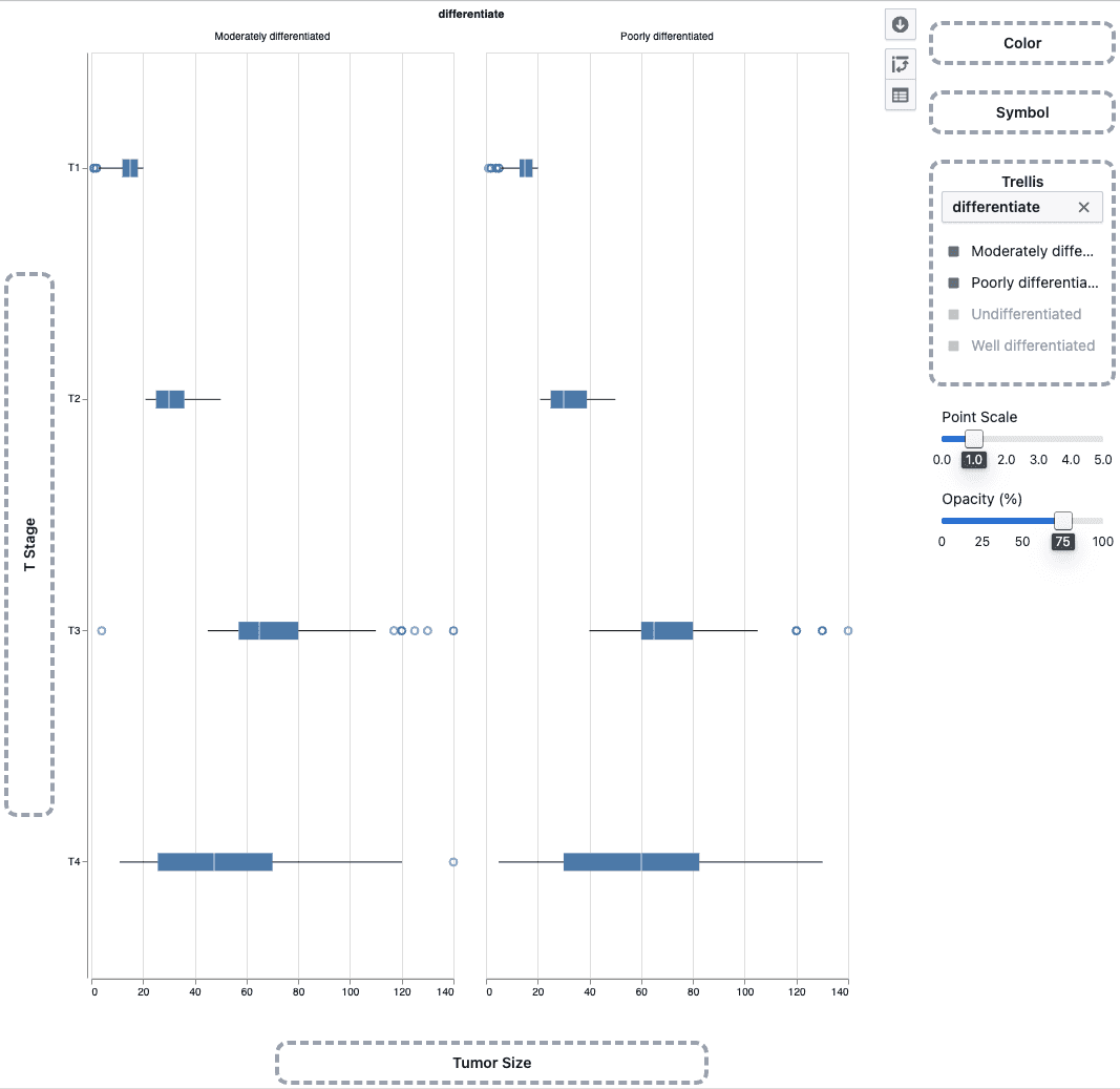
Trellis box plot

  • Use the trellis legend to choose which categories to display
  • Up to 4 panels can be shown at a time

Notes​

  • Heatmaps do not support trellis
  • Trellis behavior may continue to evolve during the beta phase
  • If you notice any unexpected behavior, please share steps to reproduce